
![picture[1]-Implementing Gradient Shadow Effects with CSS-PANDA](https://oss.imwmi.com/file/imwmi/webp/2024/01/QQ20231229104344.webp)
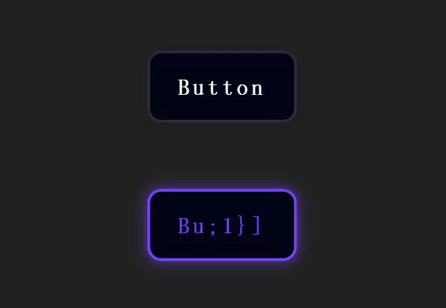
By utilizing the CSS ‘box-shadow’ property, you can create gradient shadow effects for elements. Define the shadow’s color and offsets to give the element a sense of depth.
.box {
  box-shadow: 0 4px 6px rgba(0, 0, 0, 0.1), inset 0 0 8px rgba(255, 255, 255, 0.5);
}
Implementing gradient shadow effects using CSS involves utilizing the box-shadow property. Here’s an example:
HTML:
<div class="gradient-shadow">
  Gradient Shadow Example
</div>
CSS:
/* Styling for the element with gradient shadow */
.gradient-shadow {
  width: 200px;
  height: 100px;
  background-color: #f0f0f0;
  border-radius: 8px;
  padding: 20px;
  text-align: center;
  box-shadow: 5px 5px 15px 5px rgba(255, 0, 0, 0.5) inset,
              -5px -5px 15px 5px rgba(0, 0, 255, 0.5) inset;
  /* Adjust shadow colors and offsets for desired gradient effect */
}
Explanation:
.gradient-shadow: This class styles the element that will have the gradient shadow effect.box-shadow: This property creates the shadow effect:5px 5px 15px 5px rgba(255, 0, 0, 0.5) inset: Specifies a red shadow with an inset effect.-5px -5px 15px 5px rgba(0, 0, 255, 0.5) inset: Specifies a blue shadow with an inset effect.- Adjust the values (offsets, blur radius, colors, etc.) to create the desired gradient shadow effect.
Modify the .gradient-shadow class properties, such as width, height, background-color, box-shadow values, and offsets, to achieve the desired gradient shadow effect for your element.
THE END


No comments