![picture[1]-Implementing Hover Effects with CSS-PANDA](https://oss.imwmi.com/file/imwmi/webp/2024/01/QQ20231229103430.webp)
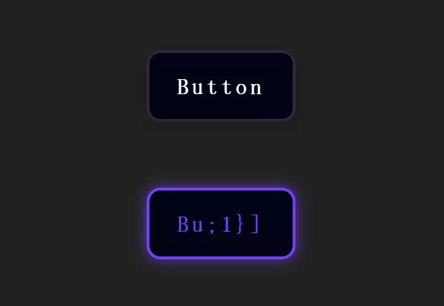
By using the CSS :hover pseudo-class and transform property, you can create various hover effects for elements, such as scaling, rotating, tilting, and more.
.box {
  transition: transform 0.3s ease-in-out;
}

.box:hover {
  transform: scale(1.2);
}
Implementing hover effects using CSS involves utilizing the :hover pseudo-class along with properties like transform, allowing for various visual changes when hovering over elements. Here’s an example:
HTML:
<div class="hover-effect">
  Hover Effect Example
</div>
CSS:
/* Styling for the element with hover effect */
.hover-effect {
  width: 200px;
  height: 200px;
  background-color: #3498db;
  color: white;
  text-align: center;
  line-height: 200px;
  transition: transform 0.3s ease-in-out; /* Transition for smooth animation */
}

/* Define the transformation on hover */
.hover-effect:hover {
  transform: scale(1.1) rotate(10deg); /* Adjust transformation values as needed */
}
Explanation:
.hover-effect: This class styles the element that will have the hover effect.transition: transform 0.3s ease-in-out;: Specifies the transition property for smooth animation. In this case, thetransformproperty will have a duration of0.3swith an easing effect ofease-in-out..hover-effect:hover: Defines the transformation when the element is hovered over. You can modify the transformation values (e.g.,scale,rotate,skew, etc.) within thetransformproperty to create different hover effects.
Feel free to adjust the .hover-effect class properties and the transform values to experiment and create various hover effects such as scaling, rotating, skewing, etc., based on your design preferences.
THE END


No comments