
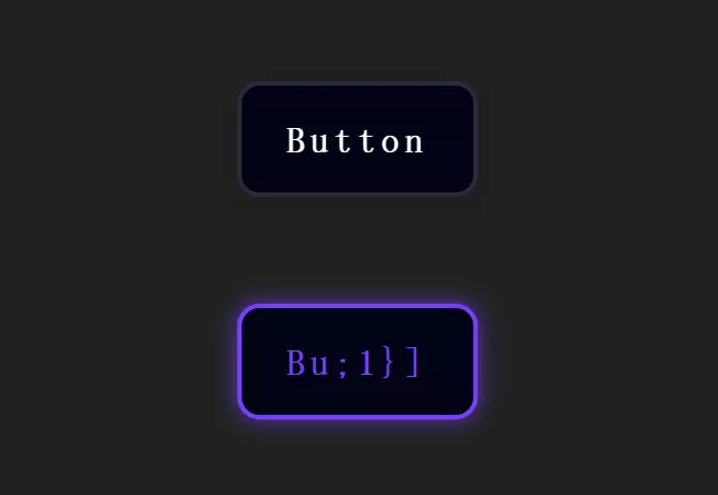
![picture[1]-Implementing Transparency Animation Effects with CSS-PANDA](https://oss.imwmi.com/file/imwmi/webp/2024/01/QQ20231229103044.webp)
By utilizing the CSS opacity property along with the transition property, you can create opacity animation effects for elements. This allows you to control the element’s transparency, smoothly fading it in or out during transitions.
.box {
  opacity: 0;
  transition: opacity 0.3s ease-in-out;
}
.box:hover {
  opacity: 1;
}
To implement transparency animation effects using CSS, you can use the opacity property along with the transition property. Here’s an example:
HTML:
<div class="transparent-element">
  Transparency Animation Example
</div>
CSS:
/* Styling for the element with transparency animation */
.transparent-element {
  width: 200px;
  height: 200px;
  background-color: #3498db;
  color: white;
  text-align: center;
  line-height: 200px;
  transition: opacity 0.5s ease-in-out; /* Transition for smooth animation */
}

/* Define the opacity change on hover or any other trigger */
.transparent-element:hover {
  opacity: 0.5; /* Adjust opacity value (0 to 1) */
}
Explanation:
.transparent-element: This class styles the element that will have the transparency animation.transition: opacity 0.5s ease-in-out;: Specifies the transition property for smooth animation. In this case, theopacityproperty will have a duration of0.5swith an easing effect ofease-in-out..transparent-element:hover: Defines the opacity change when the element is hovered over. You can trigger the animation based on other events or states as well (:active,:focus, etc.).
Adjust the .transparent-element class properties, such as width, height, background-color, and transition values to suit your design. The opacity property controls the transparency level of the element, ranging from 0 (completely transparent) to 1 (fully opaque).
THE END


No comments