
![picture[1]-Implementing Gradient Border Styles with CSS-PANDA](https://oss.imwmi.com/file/imwmi/webp/2024/01/QQ20231228172133.webp)
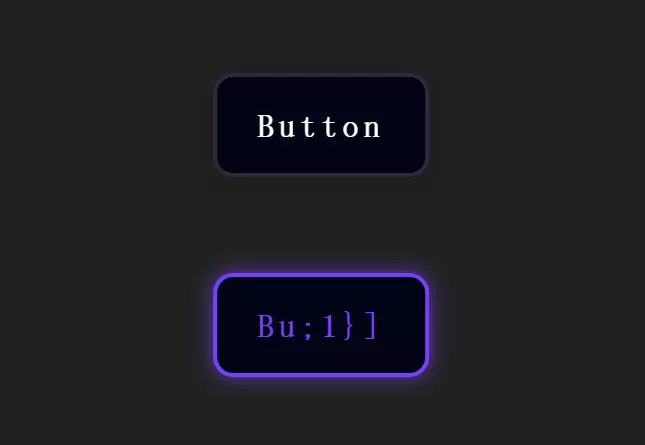
By using the CSS border-image property, you can create border styles with gradient effects. Define gradient images or colors as the source for the border, along with the slicing method and width of the border.
.border {
  border: 10px solid;
  border-image: linear-gradient(to right, #ff5500, #ffd200) 1;
}
Implementing gradient border styles with CSS involves using the border-image property. Here’s an example:
HTML:
<div class="gradient-border">
  Gradient Border Example
</div>
CSS:
/* Styling for the element with gradient border */
.gradient-border {
  border-width: 10px; /* Adjust border width as needed */
  border-style: solid;
  padding: 20px; /* Optional: Adding padding for better visualization */

  /* Gradient as the border source */
  border-image: linear-gradient(to right, #ffcc00, #ff6699); /* Adjust gradient colors and direction */
}
Explanation:
border-width: Defines the width of the border.border-style: Specifies the border style (e.g.,solid,dotted,dashed, etc.).padding: Optional padding for better visualization of the border.border-image: This property sets an image or gradient as the border source. In this example, a linear gradient is used as the border source using thelinear-gradientfunction. You can adjust the gradient colors, direction (to right,to left,to top,to bottom, etc.), and other gradient parameters as needed.
Modify the .gradient-border class properties according to your design requirements, adjusting the gradient colors, direction, width, and style to achieve the desired gradient border effect.
THE END


No comments