
![picture[1]-Implementing Shadow Effects with CSS-PANDA](https://oss.imwmi.com/file/imwmi/webp/2024/01/QQ20231228163610.webp)
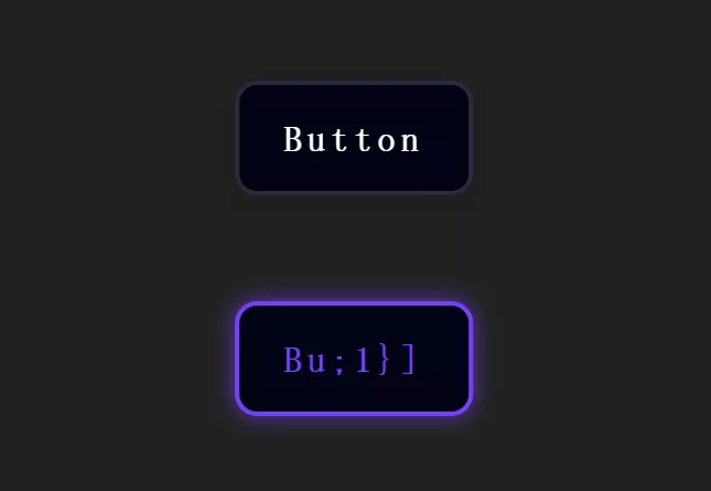
By using the CSS ‘box-shadow’ property, you can add shadow effects to elements, providing them with a sense of depth and dimension. Adjusting the shadow’s color, blur radius, and offset allows for achieving various visual effects.
.box {
  box-shadow: 0 2px 4px rgba(0, 0, 0, 0.2);
}
To implement shadow effects using CSS, you can use the box-shadow property. Here’s an example demonstrating its usage:
HTML
<div class="shadow-element">
  Shadow Effect Example
</div>
CSS
/* Styling the element */
.shadow-element {
  width: 200px;
  height: 100px;
  background-color: #f0f0f0;
  border-radius: 8px;
  padding: 20px;
  text-align: center;
  box-shadow: 2px 2px 6px rgba(0, 0, 0, 0.3);
}
Explanation
box-shadowproperty: Sets the shadow effect.2px 2px 6px rgba(0, 0, 0, 0.3): This defines the shadow:2px: Horizontal offset of the shadow.2px: Vertical offset of the shadow.6px: Blur radius of the shadow.rgba(0, 0, 0, 0.3): Shadow color in RGBA format (rgba(red, green, blue, alpha)), where0.3is the alpha value for transparency.
You can adjust these values (horizontal offset, vertical offset, blur radius, color, etc.) in the box-shadow property to create different shadow effects based on your design requirements.
THE END


No comments